Stippling applying the Hard Disk Sampling method with a CMYK color basis. Original image from pennlive.com. Click for full resolution.
At the end of writing my post on Stippling and Blue Noise, I left it wondering how would this apply if we wanted to use colors. Just to recapitulate, the idea of stippling is to generate a reproduction of an image by halftoning, making use of fixed-size points distributed on a plane. The points need to be distributed in a way which is both aesthetically pleasing (for which we place the points carefully in a way which shows Blue Noise properties) and be spaced according to the local density of the image. If we use black dots over a white background, this simply means we need to add more dots on the darker areas of the image.
This is all better summarized in this awesome video:
It also illustrates very well why we would want to use a computer program to carry out this task 😉
More than one sample class
So the principle looks simple enough for black and white. Now, if we want to add color, the first immediate question is: Can we not just do the same for each individual R, G, B or C, M, Y, K channel? As it turns out, that would more or less work, but it will look worse than the black and white image. The reason for it is that combining individual Blue Noise distributions does not lead to a result with the same propertie. This is easy to reason about by looking at the first row on Figure 1 below: if we place samples carefully by enforcing a minimum distance between each one of them, but do so on a per-class (color) basis, nothing is preventing points belonging to different classes from ending up close to each other. Similarly, as shown in the second row, merging all samples into a single uniform distribution, and then sepparating them again into individual classes will cause noticeable gaps in the individual classes’ distribution.
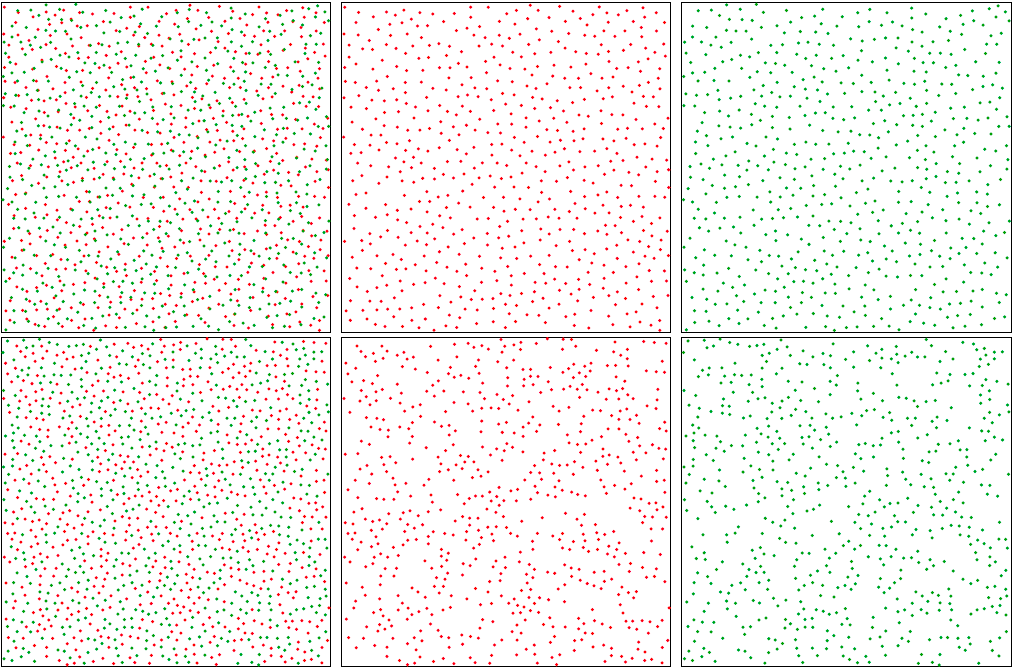
Figure 1. Top row: Uniform individual classes does not lead to uniform combined result.
Bottom row: Uniform result does not lead to uniform individual classes.
Image by [Wei 10], click for a better view.
Therefore the Hard-Disk Sampling method boils down to an easy extension of the original dart-throwing approach, where we check this carefully-built conflict matrix to decide whether or not to accept each randomly-generated color sample, producing results that sit inbetween the two extreme cases depicted in Figure 1. This sounds easy-enough to give it a shot with a quick prototype!
Hard-Disk Sampling implementation
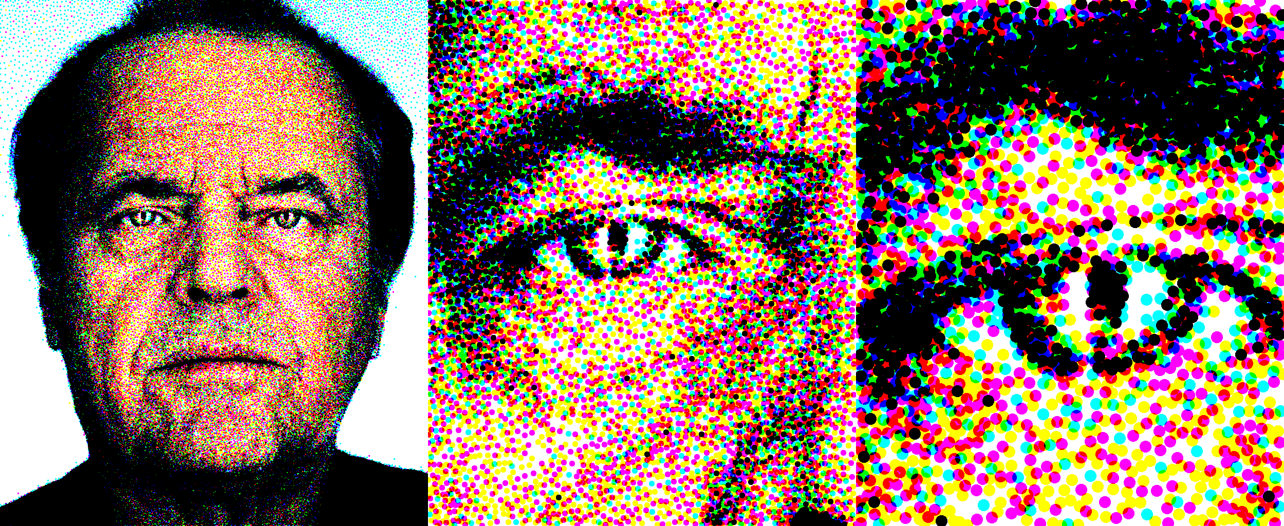
Figure 2. Stippling result using a CMYK color basis with subtractive blending. The source image is “Portrait of Jack Nicholson” by Martin Schoeller. Click for full resolution version.
The first detail to bear in mind is that the minimum distance values for each class vary in space: in our stippling case, each individual pixel of the original image has potentially a different color distribution which translates into different importance for each component of the color basis we choose. The distance matrix for a 2D image will thus be 2N dimensional, where N is the number of point classes we consider.
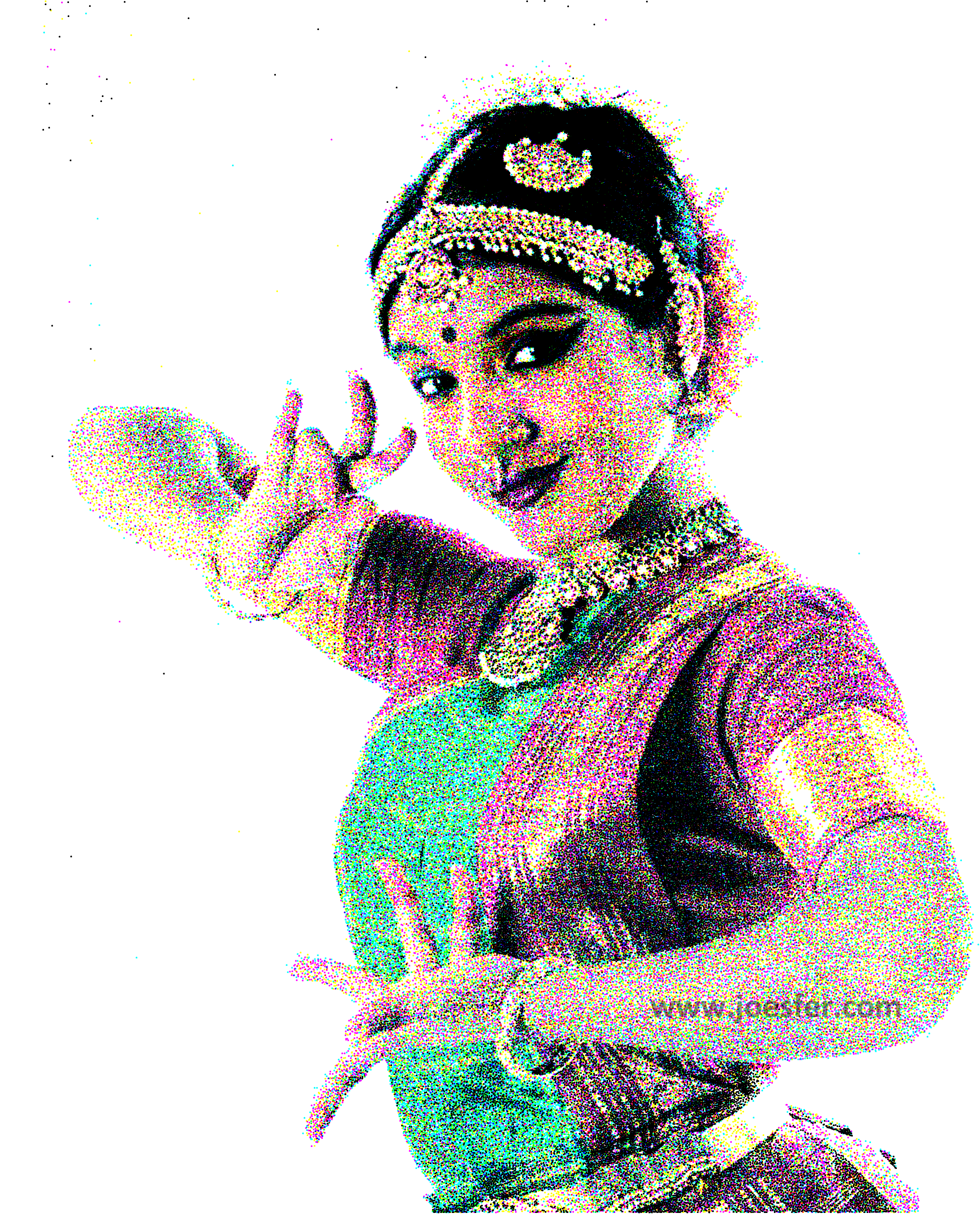
How to choose the point classes depends on the look we’re after: we can use for instance Red, Green and Blue and combine them with additive blending over a black background to emulate a screen. Or we could use Cyan, Magenta, Yellow and Black over a white background to emulate print. Any combination will do, but obviously the more classes and the closer their respective colors are to the original image, the better match. I personally find the results of restrictive color basis like the two aforementioned to be more interesting, as they let you better appreciate how the result emerges from the combination of all the individual samples rather than from a perfect match of each individual sample.
The UI in the prototype provided will let you pick a color basis, which has a blending mode associated: (+) for additive, and (-) for subtractive. Then the density for each individual color class is extracted from each pixel on the source image by projecting the original RGB values to the elements of the chosen basis. I’ve tried different approaches to generate the per-channel densities, and what seems to be working fairly well is to take a projection of each source color into the color basis by doing the dot-product of their resulting vectors in RGB space.
![\mathbf{S} = [S^R, S^G, S^B]](https://www.joesfer.com/wp-content/ql-cache/quicklatex.com-265153dd0ab328632fa038e9798af4c1_l3.png "Rendered by QuickLaTeX.com") = source pixel
= source pixel
![\mathbf{C} = { [C_0^R, C_0^G, C_0^B], [C_1^R, C_1^G, C_1^B], ..., [C_{N-1}^R, C_{N-1}^G, C_{N-1}^B] }](https://www.joesfer.com/wp-content/ql-cache/quicklatex.com-09f8f8a1100216398f87c1d59f0eb3f5_l3.png "Rendered by QuickLaTeX.com") = desired N-class color basis
= desired N-class color basis
![\mathbf{D_S} = [ D_0, D_1, ..., D_{n-1} ]](https://www.joesfer.com/wp-content/ql-cache/quicklatex.com-00f6da719d9bee6e68eea964498456e0_l3.png "Rendered by QuickLaTeX.com") = densites for
= densites for  , where:
 is the projection of the input sample into the i-th color basis vector.
 for additive basis, and
 for subtractive basis
Note this is a non-linear response to intensity, which I found to work a bit better than the linear one.

Going back to the sampling issue shown in Figure 1, I was wondering: if for our particular case of stippling where we are interested in the combined result and not so much in the individual color channels, could we not get away with the simpler method of a uniform combined result, as shown in the second row, despite of the less uniform distribution of the individual color pigments?
To test that out it was easy to simplify the algorithm to calculate the distance matrix based solely on the brightness of the input pixels, disregarding class information. Then, when once a random sample had been accepted based exclusively on the spatial density, its class is chosen randomly from the available color basis according to a probability distribution matching the underlying pixel color.
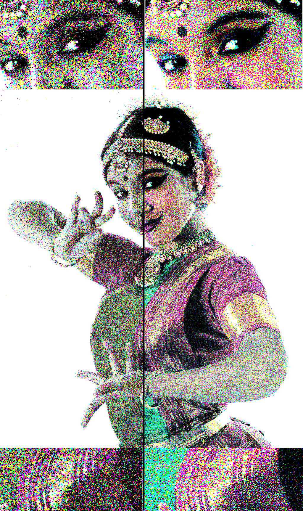
Figure 3. Comparison between single class uniform distribution (left) taking only distances between samples into account, and hard disk sampling (right) producing a uniform distribution both per class and on the combined result. Note how the sharp edges around the eyes are defined similarly, but the results differ in the smooth areas. Click for a larger view.
With this test I was expecting to still get the good spatial distribution of a single-class dart throwing, and an on-average correct color: each individual sample would be off, but on average the sum of the samples should more or less match the tone of the underlying region. Figure 3 shows the comparison between the two methods, which differ much more than I was expecting. Truth is that in high-frequency regions the adaptive sampling predominates over the more even distribution of the former method – the difference is more evident in the smoother gradients on the image such as the clothing, where you can see that my naive simplification tends to produce noisier results. Having a uniform distribution for the combined result helps achieving good gradients of density, and having good per-class distribution produces more uniform, smoother tones, with less color clumps.
Retries
An interesting aspect of the Hard Disk Sampling method as proposed in Wei’s paper is that at the core of it, we still rely on random sampling to place points in the image. This is very fast at the beginning but once the image starts to fill up, it becomes increasingly unlikely for a sample to be accepted. More so, since for a given position on the image, we’ve prioritized the classes (the densities of each class), it may be extremely hard to place samples of faint tones in the image by just random chance. Recall from the original stippling post that this is the reason why Dart-throwing is so easy to implement, but also so slow for most practical uses.
Figure 4: A blue sample couldn’t find a suitable place in the image by random chance, so it is ‘forced’ by removing much more likely green samples which will be reintroduced eventually.
There are ways to be smarter about the way we place samples (other than rely on random chance), but the alternative method proposed in the paper is to discard existing samples after we’ve given up trying to place a new one. This is simple and ingenuous: we can think of this as having samples that settle down int he image, and from time to time we need to “shake” portions of the image to dust them off and allow room for improbable samples to settle. More rigurously though 🙂 what we do is rely on the fact that the “probable” samples we remove to make room have a better chance to settle on the final image again, and the result will converge faster than if we expect the unlikely samples to find a suitable spot by randomness alone. This also leads to a better color rendition with less noise as you can see in Figure 3.
Downloads
I wrote a small prototype application which does color stippling of an input image using the Hard Disk Sampling method described in this post. It will generate both images and XML data files which should be easy to parse and render with other applications.
The code is written in C# and is available as usual on GitHub at: https://github.com/joesfer/ColorStippling
And you can also download the precompiled binaries directly from here.
References
[Wei 10] Li-Yi Wei. 2010. Multi-Class Blue Noise Sampling. Siggraph.
[Cook 86] Cook, R. L. 1986. Stochastic sampling in computer graphics. ACM Transactions on Graphics 5, 1, 51–72.
Hi. I recently played around with color stippling. I experimented with dart throwing, threshold masking (e.g. Wang tiles but without the tiles), and error diffusion (traditional dithering) techniques. I ended up combining all of them.
A really easy way to do color stippling is to use blue noise to generate the stippling, and error diffusion to assign colors from a palette. In my case, I generate a hierarchical blue noise mask with my dart thrower (actually, two-radii dart throwing), and use (slightly modified to be a bit more random) Floyd-Steinberg dithering to assign colors. I’ve not yet implemented dithering in my dart thrower (which supports stippling), but I imagine it would look very similar to the masking approach (but with a higher-quality stippling).
This isn’t as good as the multiclass approach, but it works well enough if you’re using one of the precalculated tiling methods.
I’m planning on releasing the code for the blue-noise-mask/color-dithering approach. Unfortunately my dart throwing code has gotten pulled into a work project, but all it does is implement the paper one of your commenters linked to in the last stippling post:
Ebeida et al, “A Simple Algorithm for Maximal Poisson-Disk Sampling in High Dimensions”
The masking approach is based off of this patent application (it’s so simple):
https://www.google.com/patents/US5111310
And, is it just me, or are patents much more useful than published research? I swear, the plummeting quality of peer-reviewed (ha!) computer graphics research drives me crazy.
[That said, while googling for the patent, I did find a paper the authors published at the same time: http://www.ece.rochester.edu/projects/Parker/Pubs%20PDF%20versions/44_DigHalfBNM.pdf ]
Thanks for your comment Joseph, I like the idea of using error diffusion for applying color over a blue noise density distribution. Please let me know if you have any example image, I’d love to see the results.
Ok, I’ve uploaded a few test images to github:
https://github.com/joeedh/BlueNoiseStippling/tree/master/examples
The code itself has to be cleaned up a bit before I commit it, though (among other things, only about 30% of the code is actually use; the rest is cruft from prior experiments). I’m hoping to do that today.
I’ve uploaded the (freshly refactored) code as well. You can it out online there, too (it’s a web app):
https://github.com/joeedh/BlueNoiseStippling
BTW, I was reading Ostromoukhov’s 2001 paper, and it turns out stippling methods based on progressive blue noise point sets are inherently blury. I was already using a reconstruction filter to sample images, so I made it into a sharpening one, and it does seem to make a big difference.
I forget to add a link to the paper:
http://liris.cnrs.fr/victor.ostromoukhov/publications/pdf/SIGGRAPH01_varcoeffED.pdf
Thanks for all the references and source code! browsing through the examples, I must say your approach generates some beautiful results. I’m currently tinkering with the app on the browser, though I don’t seem to get past the first update (which generates a block of rows); perhaps it is just killing my Firefox.
You mentioned that you ended up not using the blue noise mask approach, favouring a more ‘error diffusion’-based method using progressive blue noise. It’d be interesting to know your thoughts about the approach and whether you ditched it because of performance or quality reasons (is that still a concern in modern hardware compared to 1992?) or simply whether we can now afford superior albeit more expensive methods.
Also, I concur with your observations on blurriness, I had to up-scale images myself in order to get enough density of points per pixel, though the darker areas on your Merida image look nicely covered in samples. How does [Ebeida 2012] behave for these difficult high density areas with unlikely samples?
Sorry I wasn’t clear, I’m still using the masking approach, but I’ve modified it a bit. The original algorithm tended to produce a grid pattern (which you can still see if you check “Be More Grid Like” and make sure “Added Random” is zero). All I’ve done it modified it a bit by sampling 16 mask pixels at a time, and then moving the final stipple point to the pixel that passes the masking test. I’ve tried to illustrate it here:
http://www.pasteall.org/pic/94181
The grid sample is the large circle, it’s moved to the point that passes the masking test.
Ebeida’s paper by itself doesn’t address arbitrary density functions, when I first applied it to that I had problems with sharp edges between light/dark areas:
http://www.pasteall.org/pic/94178
Luckily this is pretty easy to fix by sampling the dark areas first. This can be done with a minimum density threshold that increases on each iteration. Here is the result:
http://www.pasteall.org/pic/94180
(Forgive the general crappyness of the contrast in those two images, they’re just meant to illustrate the dark/light transition problem).
Btw, Firefox is working fine for me. Any chance you could send me the console output (press CTRL-SHIFT-K)? You can start a new Issue on Github:
https://github.com/joeedh/BlueNoiseStippling/issues
By the way, I don’t know if you’ve ever tried silk screen printing (the simpler kind artists use, not the commercial kind):
https://www.google.com/search?q=silk+screen+printing&espv=2&biw=1242&bih=546&site=webhp&source=lnms&tbm=isch&sa=X&ved=0CAgQ_AUoA2oVChMIufD9lZ3FyAIVUjOICh1ndg5R#imgrc=tQmb5i_orbGttM%3A
It’s kindof fun and not all that hard, and I was thinking I’d try making silk screen masks out of the output of this method.